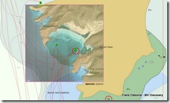
If you click on the image to enlarge it, you can see that our waypoints where we anchored are up on land with this chart and there is a dreadful lack of detail.
Fortunately the Mexican Navy has been doing a new survey since 2005, using borrowed US equipment they say, and have published new vector charts that while not up to the standards of US NOAA charts, are a substantial improvement over the older charts. Here’s the same area using the new vector charts -
At least the land is in the right spot. Now we can add a third type of chart to the collection, charts from Google Earth satellite images. I’ve started playing with a program ChartAid that makes it very easy to capture images from Google Earth and geo-reference them so that chart plotting software like CE knows where to place them. Here’s the same spot with the addition of the photo chart -
These Google Earth photo’s are not perfect, they don’t show depth for example, but outside of the US, Canada, and Europe they might be a great improvement over existing charts. They certainly enhance areas in Mexico. Will we rely exclusively on photo charts? No, but they are another tool, along with existing charts and guide books, that we can use to stay out of trouble.


